100 Free 4k UHD Background Photos

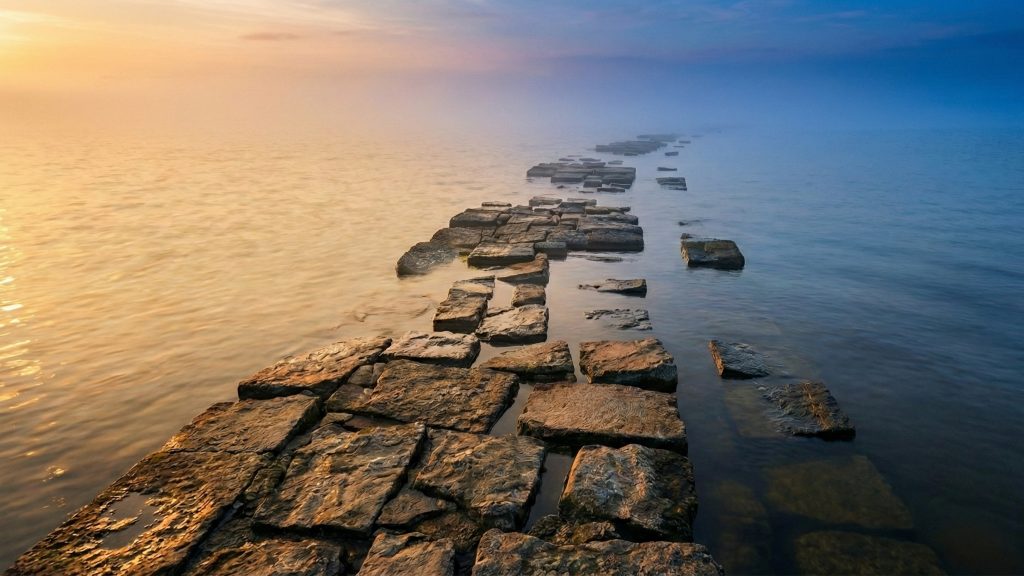
I went through my landscape photos and picked the best hundred, then spent time enhancing each one to make a good background image at 4k resolution (3840×2160 pixels). I have shared them through this Google Photos album under the CC BY-NC-SA license so you can save your favorites. If you simply save the images to an album in your own Google Photos then you can set that as your “Screensaver” for any Google-connected TV or device. Enjoy!

Today’s LLM Challenge: Create a diagram

Ask an LLM to create a technical diagram and they’ll use a diffusion generator, which produces funny but mostly nonsensical results. But they tend to be pretty good at writing code, so I thought I’d see how they can do with the following prompt:

Describe a diagram suitable for a textbook that illustrates the definition of “cross-sectional area”. Then create SVG code to render that.

The description is easy, so I’m only going to show the SVG images they produced.


ChatGPT 4o

Claude 3.5 Sonnet


Perplexity

Bing

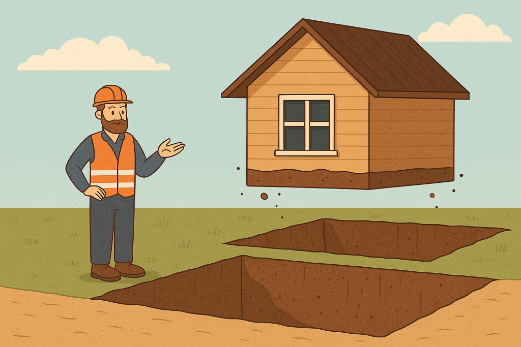
Bing also volunteered four diffusion images, first of trees like this:

Then I asked it to try again using a simple cylinder and got these cool but not usable results:


The smaller models available through HuggingChat were worse, and Cohere didn’t even get the SVG namespace into the XML. Here’s what I got from the top three:

Privacy.com to thwart subscriptions

Businesses love the recurring revenue from subscriptions. And they love the fact that people tend to be so lazy and forgetful that customers don’t reliably cancel subscriptions that they wouldn’t otherwise keep. As a conscientious consumer, I dislike subscription services because businesses have a disincentive to make cancelling subscriptions easy. I disapprove of the roach motel business model. My favorite countermeasure: Privacy.com.

Privacy.com lets you create credit cards with all sorts of constraints, as shown in this screenshot:

Screenshot of Privacy.com credit card limits.

I particularly like the single-use card, which I create for subscription services. If I forget about the service they can’t keep sucking money from my bank. If I want to cancel the service, I don’t have to find and navigate their arbitrary cancellation processes … and keep records of cancellation attempts to dispute recurring charges from those businesses that are either incompetent or downright fraudulent when it comes to cancelling subscriptions. If I do want to continue subscribing, I have found that every business goes above and beyond to make that as easy as possible!

Inkscape vs Adobe Illustrator for Vector Graphics

I’m about to break 100 figures (that’s photos, diagrams, and combinations thereof) for my book, which in current draft is 150 pages. Whenever possible I create vector images because they scale perfectly. The alternative is a raster (pixel-based) image, which is defined for some number of pixels and becomes pixelated when enlarged. Here’s an extreme example: I drew a simple circle, rasterized a copy of it, and then zoomed in on the top section:

The vectorized version stays smooth at any scale, because the rendering engine is essentially told, “The drawing is a black circle, this size with this line thickness.” (The SVG code is actually <circle cx="50" cy="50" r="40" stroke="black" stroke-width="1" />.) The rasterized version is a fixed rendering of that circle using a specified number of pixels, and that’s as detailed as the image can get.

Raster images are natural for things like photos that begin life as pixel arrays. But computer drawings that are built up using primitive shapes and strokes almost always benefit by preserving that construction. A bonus is that vector files tend to be much smaller than legible raster versions – even in the human-readable Scalable Vector Graphics (SVG) format.

I have created vector images directly in Word (more on this later), Excel, and Python (using matplotlib and seaborn). For just $5 I got a Ukrainian freelancer on Fiverr to vectorize a diagram from an old military publication.

Until recently I used Adobe Illustrator to do more serious vector graphics. But my latest copy of that software is from 2007 and doesn’t always work well in Windows 10. (Yes, I got it back when you could buy and keep using an application instead of having to subscribe.) If I did this stuff all the time I would probably subscribe to Adobe Creative Cloud. But I don’t, so I took a look around and found a popular open-source alternative to Illustrator: Inkscape. It took a day to get comfortable with it, and now it’s great for my purposes. For example, I liked this drawing from a 2004 dissertation by Jorma Jussila, and he was kind enough to send me the vector image, which gave me a tremendous head start creating this diagram:

How Microsoft Let Me Down This Week

In college (1998) I wrote a graphics-heavy term paper in Word. I had invested days of work, saving frequently (as always). At some point Word corrupted the document, but I didn’t realize that because I had kept it open on my computer and the in-process version didn’t give a hint that anything was wrong. Until I tried sending it to a printer, at which point it crashed and I discovered that none of the files contained much that could be salvaged. It took a frantic day to reproduce the paper.

Well, that summer I had a great internship at Microsoft, and – not one to hold a grudge – I have been drafting my current book in Word. (As of today the DOCX is 100MB!) But I have been frequently creating and checking PDFs along the way. In the course of these reviews I discovered that Word is unpredictable in creating and handling vector drawing objects. For example, adding a bevel to a circle causes Word to rasterize it, but you probably won’t notice unless you make a point of inspecting things at high zoom multiples.

Create a circle in Word and it’s a vector drawing (left). Add a bevel and Word silently rasterizes it (right).

I also discovered that Microsoft’s PDF printers and export engines rasterize everything, which is not only a loss of detail, but also a travesty given that vectors are a foundation of the Portable Document Format. Fortunately there are free PDF printers (I verified both doPDF or CutePDF) that preserve vectors.

Two Weird Tricks for Presbyopia

I used to have perfect vision: In my 20s I passed the rigorous Air Force optometry screening for pilot candidates. Now in my late 40s I have developed the inevitable presbyopia that comes with age: The lenses of my eyes have lost so much flexibility that I can’t focus on things as close as I used to. I can no longer read fine print that used to be easily legible. In dimly lit restaurants I struggle to read menus. Both of these can be solved with reading glasses, but I don’t routinely carry those. So I often rely on two tricks to compensate.

The first trick is to increase light. I can read almost anything in direct sunlight.. In a restaurant I pull out my phone and shine its illuminator on the menu. Why does adding light sharpen text that is otherwise blurry or out of focus? There are some interesting optics at work.

The following image contrasts two photos of the same human eye. The photo on the left was taken in a dimly lit room, which has encouraged the pupil to open to let in more light. The photo on the right was taken with daylight coming through a window: The extra light causes the pupil to close.

Photos of the same eye in dim (left) and bright (right) light.

The wider the aperture (which in an eye is the pupil), the greater the focal range of a lens. In sunlight our pupils are as small as they can get, which gives us the maximum focal range. With presbyopia, my lenses can’t accommodate (i.e., change shape to shift focus) as close as they used to, but they can still go far enough that the added focal range from a small pupil brings close objects into focus. The same physics applies to camera lenses, as I demonstrate in the following image:

Illustration: First row: A camera pointed at a pill bottle inside its lens’s minimum focal distance. Second row: The lens aperture shown open to f/2.8, and the photo produced with the aperture wide open (f/1.7). Third row: The lens aperture stopped closed to f/22 and the photo of the same scene

I put a pill bottle closer than the minimum focal distance of this camera lens. A photo taken with the lens aperture wide open (f/1.7) shows that the lens can’t bring the text into focus. Keeping the lens at the same distance and focus setting, but stopping the aperture down almost as small as it gets (f/22) increases the focal range and brings the text into focus. (The photo of the lens in the second row actually shows the diaphragm at f/2.8 because at f/1.7 it can’t be seen.)

Bright light causes our pupil to contract naturally. The second trick is to create an artificially small aperture. You can do this by putting a pinhole lens close to your eye. I do this by closing my fingers and looking through the tiny opening left between two of them at the joint:

David Bookstaber creating pinhole lens for one eye to bring closer objects into focus.

The aperture trick can only compensate so much: With too little light the subject may be in focus but the contrast might be too low to read it. In the camera example: The exposure with the wide aperture was made in 1/640 of a second, but it took 1/4 second to get an adequate exposure at the minimum aperture (holding all other settings constant).


I have a related post on my substack: Why I Dislike Dark Mode.

On the new default font: Aptos

Given my surname, Bookstaber (German for speller), I could be more of a typeface geek. At least I am paying enough attention to appreciate the appearance of a new default font in Microsoft Office: Aptos has replaced Calibri.

I never felt completely comfortable with Calibri, though I can’t articulate why. I can point to one particular failure, which it shares with many other fonts: Upper-case I (“eye”) and lower-case l (“ell”) are virtually indistinguishable. There’s no reason for a workhorse typeface to perpetrate such an ambiguity. (Aptos, like others, avoids this by giving the l a little tail, as shown in the image below.)

Other ambiguities that appear in many typefaces:

  • Lower a that looks too much like lower o. See, for example, Century Gothic below.
  • Insufficiently distinct upper O and number 0.
  • Upper Q that is insufficiently distinct from upper O. This has become particularly annoying where TV manufacturers have begun using the term “QLED” to describe their displays, sowing confusion with the distinctly superior and more expensive “OLED” (organic LED) technology.
Typeface Ambiguities

How to Cook Chicken

I don’t like raw chicken. I associate its smell with salmonella, and when I see it I want to don a hazmat suit and break out a bottle of clorox. I long ago gave up cooking chicken myself: I err on the side of overcooking, and overcooked chicken is tough and dry. But I do like properly cooked chicken. It so happens that my mother is a phenomenal and experienced cook. So I asked her how she makes chicken so delicious every time. Here is her answer:

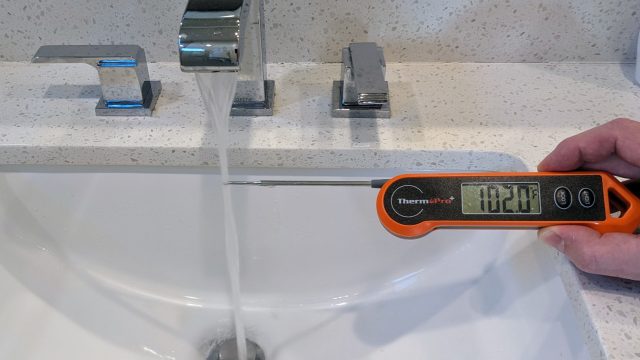
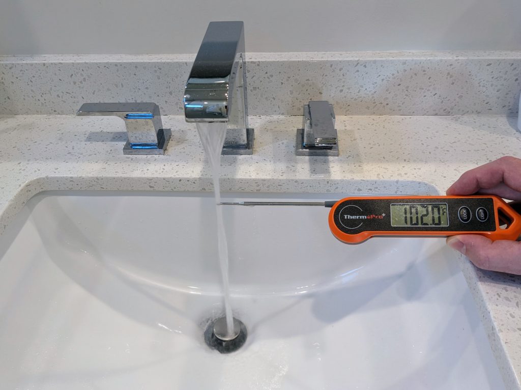
First, equipment: An accurate instant-read thermometer is essential. Expect to pay at least $40 for one by such companies as ThermoWorks or ThermoPro.

Now, for boneless, skinless chicken breasts:

  1. Pound.  Place the thawed breasts in a zip lock bag and pound the thickest portion (using a heavy bottle, rolling pin, or the bottom of a glass) so the breast has a more uniform thickness throughout. You want it to be about ¾” thick.  This helps it cook more evenly. 
  2. Cut.  Cut each breast into about a 6-8 oz portion. 
  3. Brine. Place the breasts back Into the same zip lock bag. Add about 2 cups cold water and 2 Tablespoons salt. You want the water to cover the chicken.  If you need another cup of water and tablespoon of salt, add it.  Close the bag, pressing out some of the air.  Massage slightly to try to dissolve some of the salt.  Place in a container like a pie plate or shallow bowl in case the bag leaks.  Refrigerate for 30 minutes.  (Note: If you want to prepare the chicken ahead of time, you can let it soak in a weaker brine for hours.  About 1 teaspoon salt to 2 cups cold water.)
  4. Cook.  The most important thing is to cook it until it is 155-160 degrees F. To check the temperature, insert the probe into the thickest part of the breast. 
  5. Rest.  After it reaches 155-160 remove it from the heat to a plate, tent it with foil, and let it rest for 5-10 minutes before you cut into it.  Covering it lightly with foil and letting it rest off heat brings it up to 165 degrees, the safe temp for chicken.  Letting it rest allows the juices to recede away from the surface and back into the muscle tissue.  

Reheating Chicken

Even if chicken was great when first cooked, microwaving it inevitably ruins it for me. Apparently this is a problem called “warmed over flavor” that is so well known that foodies refer to it as WOF. Minimizing the meat’s exposure to oxygen can prevent this. Also reheating sous vide, or even in a conventional oven, seems to reduce WOF compared to microwaving. But supposedly nothing short of prompt vacuum sealing can totally eliminate WOF for those who are sensitive to it.

Autumn Equinox

I happened to be in Salt Lake City during the equinox, where I learned that Utah has outlawed a lot of things. One random example: Happy Hour. Probably Utah also prohibits human sacrifices during equinox celebrations – I didn’t even bother to ask.

So aside from weird rules what else is there in Salt Lake City? Mountains. As my many readers know, I love to photograph interesting celestial events. So I went for a hike to get this equinox sunset:

Salt Lake City autumn equinox, 7500′ ASL

These foothills can be deceptive. I parked at one between the Big and Little Cottonwood Canyons and began to climb straight towards a peak. The first few hundred feet was fine gravel, so I had to kind of scamper from weed to weed to avoid sinking and sliding back. Then I reached sturdier ground which supports thickets of shrub-like oak trees. Those obstruct the view of what’s above, so I couldn’t be certain whether I had a good path ahead. I did eventually run into a trail bearing human footprints (though I saw no one else the entire hike). The trail wound back and forth between rocks and trees, and it was still very strenuous: When I got back I checked a topographic map and found that the straight-line route I followed from 5500 to 7500 feet averaged a 45 degree slope!