Given my surname, Bookstaber (German for speller), I could be more of a typeface geek. At least I am paying enough attention to appreciate the appearance of a new default font in Microsoft Office: Aptos has replaced Calibri.
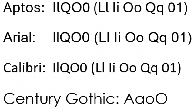
I never felt completely comfortable with Calibri, though I can’t articulate why. I can point to one particular failure, which it shares with many other fonts: Upper-case I (“eye”) and lower-case l (“ell”) are virtually indistinguishable. There’s no reason for a workhorse typeface to perpetrate such an ambiguity. (Aptos, like others, avoids this by giving the l a little tail, as shown in the image below.)
Other ambiguities that appear in many typefaces:
- Lower a that looks too much like lower o. See, for example, Century Gothic below.
- Insufficiently distinct upper O and number 0.
- Upper Q that is insufficiently distinct from upper O. This has become particularly annoying where TV manufacturers have begun using the term “QLED” to describe their displays, sowing confusion with the distinctly superior and more expensive “OLED” (organic LED) technology.

